
Decades before Fukushima, the nuclear industry had taken a fundamental methodological step: moving away from exclusively deterministic safety assessments and toward a systematic probabilistic analysis of possible accident pathways. The "Rasmussen Report"—officially titled Reactor Safety Study, WASH-1400, or NUREG-75/014—published in 1975, is considered the first comprehensive Probabilistic Risk Assessment (PRA) for commercial nuclear power plants in the United States. The three-year project was carried out under the technical leadership of MIT Professor Norman C. Rasmussen and AEC project manager Saul Levine.
Methodologically, WASH-1400 was groundbreaking. Fault trees and event trees were used to analyze complex chains of technical failures, common causes of failure, and human actions. At its core, the study addressed three questions that continue to shape modern risk analysis to this day: What can go wrong? How likely is it? And what consequences might result? Risk was thus no longer understood merely as a single assumption or "worst-case scenario," but rather as a set of possible accident sequences with varying probabilities and consequences.
However, the study sparked a fierce scientific controversy. In particular, the very low calculated accident probabilities gave the impression of a level of precision that the available data and models could not support. An independent review led by physicist Harold Lewis acknowledged the methodology but criticized significant uncertainties and the way the results were communicated in the summary. The U.S. Nuclear Regulatory Commission subsequently distanced itself from parts of the original Executive Summary and urged caution in interpreting the numerical results.
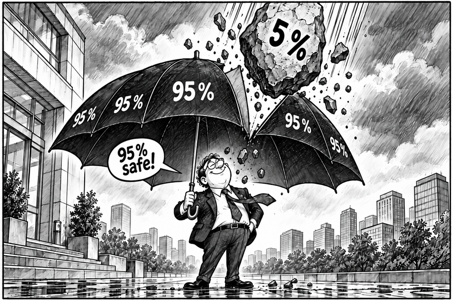
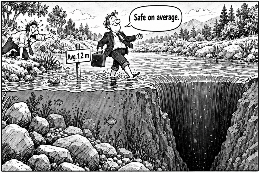
After the Three Mile Island reactor accident in 1979, probabilistic risk assessment regained significant importance. WASH-1400 had identified combinations of minor coolant losses, system failures, and operator errors as relevant accident pathways. The historical lesson is therefore noteworthy: the problem was not the concept of probabilistic risk assessment itself. The problem arose when uncertain, very small probabilities were treated as reliable certainties. Or to put it more bluntly: the problem begins when a small probability is mentally reduced to zero.
The 15-Meter Scenario
In 2008, as part of a reassessment of the tsunami risk for the Fukushima Daiichi Nuclear Power Plant, TEPCO calculated a scenario with a possible wave height of more than 15 meters. The IAEA documents that TEPCO did not derive any concrete protective measures from this estimate prior to the 2011 accident; other adjustments to tsunami protection—made earlier or concurrently—proved to be insufficient. The IAEA later concluded that decisions regarding events with low probability and high consequences had not been adequately assessed or implemented. The assumption that existing protective measures were sufficiently robust against such rare external events proved to be fatal.
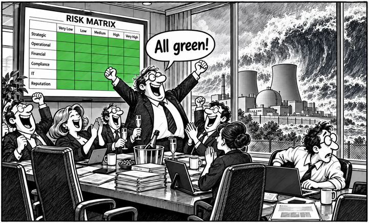
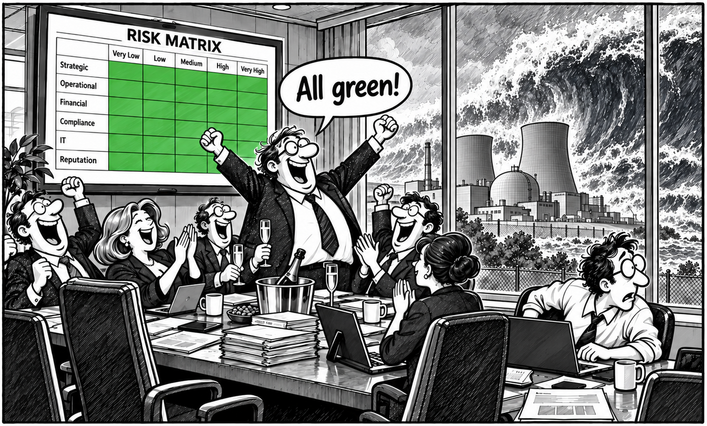
Of course, this doesn't mean that a nice risk matrix was showing "green" anywhere at the time. But the underlying cognitive trap feels very familiar from today's risk workshops: An unlikely scenario is quickly dismissed as a non-critical risk.
The Reassuring Logic of the Matrix
This brings us to one of the most popular tools of modern risk management: the risk matrix. It looks fantastic. Neat little boxes. Green, yellow, red. In the bottom left, you can rest easy; in the top right, things get uncomfortable. After a two-hour workshop, twenty points are plotted on the matrix, the board finally has "transparency," and the risk manager can confidently announce: "Everything's in the green zone." The only problem is: What exactly is this "point"? Is it the expected value? The most likely scenario? The maximum conceivable loss? The 95th percentile? A realistic worst-case scenario? Or the off-the-cuff assessment of five people who, just before their lunch break, collectively decided that a probability of three and an impact of two were somehow plausible?
Added to this is a fundamental problem with classic matrix logic: the real world of risk is by no means evenly distributed across all the boxes. Events that occur very frequently and simultaneously cause damage that threatens a company's very existence are, by their very nature, rare for companies that are capable of long-term survival. If, for example, a company were highly likely to suffer damage several times a year that threatens its very existence, its business model would hardly be sustainable in the long run. Such combinations of "very likely" and "catastrophic" are therefore rather exceptional cases in practice.
Two other risk categories are more typical. On the one hand, there are frequency risks: relatively frequent events with mostly manageable consequences—machine breakdowns, minor quality issues, bad debt, or IT disruptions. These often form part of a company's statistically observable "background noise" and can be modeled relatively well using historical data. On the other hand are rare but potentially very severe events: large-scale cyberattacks, natural disasters, massive supply chain disruptions, geopolitical shocks, or liability claims that threaten a company's very existence. This is precisely where tail risks lie—events with a low probability of occurrence but extreme consequences.
Consequently, the very area that a risk matrix tends to downplay is particularly relevant to decision-making: A rare event shifts to the left due to its low probability—and can thus, despite catastrophic consequences, visually end up in a yellow or even green zone. The color then conveys a sense of reassurance, even though a scenario threatening liquidity, equity, or even the company's very existence may be hidden at the far right of the underlying loss distribution. The interesting question is therefore not just: How likely is an event? But also: What happens if that very unlikely scenario actually occurs?
A risk is not a single point
A risk is not a single point. A risk is a set of possible scenarios. Take a cyberattack, for example. In many cases, little happens: a few systems go down, the IT team works through the night, and production is back up and running the next morning. In a less favorable scenario, ERP, production, and logistics come to a standstill for three days. In an even more critical scenario, invoicing and payment processing also fail, customers walk away, and the business interruption lasts two weeks. Perhaps 90 percent of all possible outcomes fall within a comparatively harmless range. The truly interesting ten percent, however, lie far to the right in the loss distribution. A risk matrix tends to reduce this to a single point. This makes the presentation clear—but the risk may have disappeared along with it.
Tail risks are particularly problematic. Let's imagine two risks. Risk A is highly likely to cause losses between one and three million euros. Risk B usually causes almost nothing, but under unfavorable conditions can trigger a loss of 80 million euros and drive the company into a liquidity crisis. Depending on the evaluation logic, both could end up in the same yellow or even green cell. Mathematically, this tells us nothing about the actual nature of the risks. We've simply collapsed a vast number of possible futures onto two axes and then stuck a colored dot on them. It's roughly equivalent to a doctor condensing all of a patient's lab results, X-rays, and symptoms into a green smiley face and saying, "All in all, that looks pretty good."
Less Apparent Precision, More Distribution
This doesn't mean that risk matrices are fundamentally useless. They can certainly be helpful as a first point of orientation, for structuring, or for quick communication. They become dangerous when visualization is confused with analysis. Good risk analysis therefore begins one level deeper: What specific scenarios lie behind the dot? What triggers them? What dependencies are at play? How long does the outage last? What is the range of the damage? Which scenarios fall in the tail? And above all: Which scenario could truly threaten the company's very existence?
Perhaps a small warning should therefore be posted next to every risk matrix: "The color does not describe the risk." A green dot can look very reassuring. However, the fifteen-meter-high scenario cares surprisingly little about that.
The conclusion is not to banish risk matrices from the toolbox. They should simply be what they're actually capable of being: a condensed communication and prioritization aid. Analyzing critical risks requires supplementary scenario-based methods and—where data and modeling permit—probabilistic approaches.
One could therefore evolve the classic risk matrix into a "Risk Matrix 3.0". The key difference would be that the axes would no longer display exclusively subjectively estimated categories such as "Probability of Occurrence 2" and "Impact 4," but rather metrics derived from an actually modeled loss distribution. One axis could, for example, represent the median or expected value (mean) of the potential loss—that is, the typical or average risk level. The second axis could specifically depict the severity of the tail of the distribution using the expected shortfall (ES). The expected shortfall, for example, answers the question of how high the average loss is in the worst five percent or one percent of all modeled scenarios.
This would suddenly clearly separate two risks that might end up in the same box in a traditional matrix. A common operational risk could have a comparatively high expected loss but a limited expected shortfall. A cyber, natural disaster, or liability risk, on the other hand, might have a low median and perhaps even a moderate expected value, but at the same time an extremely high expected shortfall. It is precisely this asymmetry that is often more decisive for management than the color of a single matrix cell.
Such a Risk Matrix 3.0 could be further enhanced. For example, the size of a point could represent the frequency of occurrence or the risk capital, its color could indicate proximity to risk-bearing capacity, and a confidence interval or additional marker could denote model and estimation uncertainty. What was once a single, supposedly precise point would thus become a visualization that preserves much more of the actual risk structure. However, it is important to note here as well: The matrix would still be merely the surface level. The actual analysis takes place in the underlying scenario and distribution modeling.
Especially for rare events with potentially existential consequences, a single product of probability of occurrence and loss class is not sufficient. What is crucial is the overall loss distribution, possible dependencies, uncertainties in the assumptions, and robust stress and extreme scenarios. The Rasmussen Report, just like the Fukushima incident, shows that probabilistic models are valuable—but only if small probabilities are not confused with certainty and model uncertainties are handled transparently.
Perhaps, therefore, the next stage in the development of the risk matrix is not: more colors and finer grid squares, but rather: less apparent precision and more distribution.
Sources and Further Reading
- U.S. Nuclear Regulatory Commission (1975): Reactor Safety Study – An Assessment of Accident Risks in U.S. Commercial Nuclear Power Plants, NUREG-75/014 (WASH-1400). Internet
- U.S. Nuclear Regulatory Commission: The Reactor Safety Study – The Birth, Death and Rebirth of PRA. Historischer Überblick zu WASH-1400, Rasmussen, Lewis Review und Three Mile Island. Internet